Bussion Analytics · Yönetim Paneli KılavuzuBussion Analytics · Management Panel Guide
Bussion Yönetim PaneliBussion Management Panel
Bussion Analytics'i yönetmek ve yapılandırmak için kullanılan yönetici panelinin adım adım kılavuzu.A step-by-step guide to the admin panel used to manage and configure Bussion Analytics.
Giriş — Yönetim PaneliIntroduction — Management Panel
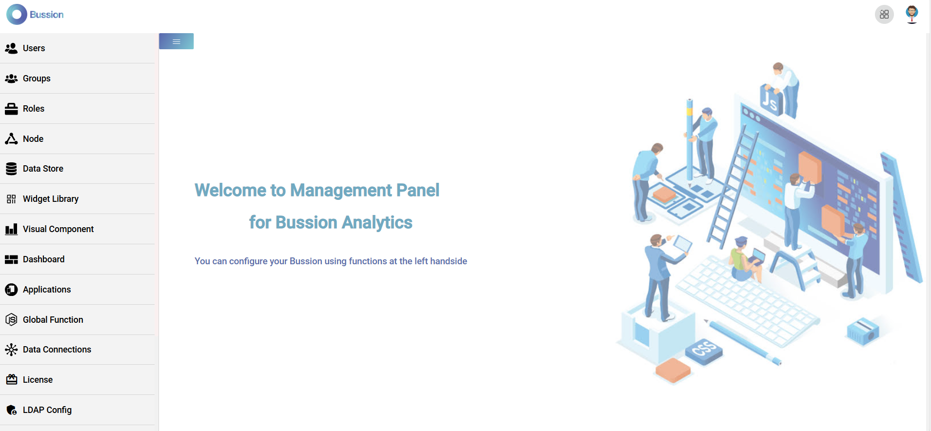
Bussion Analytics yönetici hesabıyla giriş yaptığınızda sizi bir karşılama (landing) sayfası karşılar. Solda, yöneticinin sistemi uçtan uca yapılandırdığı modüller bulunur; sağ üstte uygulama geçişi (◳) ve kullanıcı menüsü yer alır. "You can configure your Bussion using functions at the left handside" notu, tüm yapılandırmanın soldaki menüden yapıldığını söyler.When you sign in with a Bussion Analytics admin account, a landing page greets you. On the left are the modules the admin uses to configure the whole system end to end; the top-right has the app switcher (◳) and the user menu. The note "You can configure your Bussion using functions at the left handside" tells you all configuration happens from the left menu.
Yönetim Modülleri (genel bakış)Management Modules (overview)
Sol menüdeki modüller, bir Bussion sistemini kurmak ve işletmek için gereken her şeyi kapsar. Aşağıda hepsinin kısa tanımı var; ilerleyen bölümlerde her biri ekran görüntüleriyle ayrıntılı anlatılacaktır.The left-menu modules cover everything needed to set up and run a Bussion system. Below is a short description of each; the following sections will detail every one with screenshots.
| ModülModule | Ne içinUsed for |
|---|---|
| 👤 Users | Kullanıcı hesapları — kimlik, erişim ve oturum yönetimi.User accounts — identity, access and session management. |
| 👥 Groups | Kullanıcı grupları — toplu yetki ve görünürlük yönetimi.User groups — bulk permissions and visibility. |
| 🧰 Roles | Rol tanımları — neyin yapılabileceğini belirleyen izin kümeleri.Role definitions — permission sets governing what can be done. |
| ⋔ Node | Node/işleme düğümleri yapılandırması.Node/processing configuration. |
| 🗄 Data Store | Verinin saklandığı depo/katman yönetimi.Management of the store/layer where data is kept. |
| ▦ Widget Library | Yeniden kullanılabilir widget'ların kütüphanesi.A library of reusable widgets. |
| 📊 Visual Component | Görselleştirme bileşenleri (grafik/tablo vb.).Visualization components (charts/tables, etc.). |
| ▤ Dashboard | Pano (dashboard) tasarımı ve yönetimi.Dashboard design and management. |
| ⊞ Applications | Panoların/içeriklerin uygulama olarak paketlenmesi.Packaging dashboards/content as applications. |
| ƒ Global Function | Sistem genelinde kullanılan ortak (JS) fonksiyonlar.Shared (JS) functions used across the system. |
| ✸ Data Connections | Dış veri kaynaklarına bağlantılar.Connections to external data sources. |
| 🎫 License | Lisans anahtarı ve kapsam yönetimi.License key and scope management. |
| 🔗 LDAP Config | LDAP/dizin tabanlı kimlik entegrasyonu.LDAP/directory-based identity integration. |
| 🛡 Password Policy | Parola kuralları — uzunluk, karmaşıklık, geçerlilik süresi.Password rules — length, complexity, expiry. |
| 🎨 Color Palette | Arayüz ve görselleştirmelerde kullanılan renk paleti tanımları.Color palette definitions used in the UI and visualizations. |
| 📄 Scripts | Özel betikler (ör. başlangıç/dönüşüm işlemleri).Custom scripts (e.g. startup/transform tasks). |
| 🗂 Logs | Sistem log kayıtları ve izleme.System logs and monitoring. |
| ⚙ System Parameters | Genel sistem ayarları ve parametreleri.Global system settings and parameters. |
1 · Users (Kullanıcılar)
Soldaki Users modülü, sisteme giriş yapan kullanıcı hesaplarını yönetir. Açılışta bir kullanıcı listesi gelir; bir kayda tıklayınca o kullanıcının formu açılır, sağ üstteki Add New User ile yeni kullanıcı eklenir.The left-menu Users module manages the accounts that sign in to the system. It opens with a user list; clicking a row opens that user's form, and Add New User (top right) creates a new one.
Kullanıcı listesiUser list
Liste, kullanıcıları bir tabloda gösterir. Üstteki Add New User butonu yeni kayıt açar; arama kutusu (Ex. Jack) ada göre süzer.The list shows users in a table. The Add New User button creates a new record; the search box (Ex. Jack) filters by name.
| SütunColumn | AnlamMeaning |
|---|---|
| Avatar | Kullanıcının profil resmi (yoksa baş harfleri).The user's profile picture (initials if none). |
| User Id | Sistemin atadığı benzersiz kimlik.The unique id assigned by the system. |
| First / Last Name | Ad ve soyad.First and last name. |
| Giriş ve iletişim e-postası.Sign-in and contact email. | |
| Last Login | Son giriş zamanı.Last sign-in time. |
| Action | 🗑 kaydı siler.🗑 deletes the record. |
Kullanıcı formu (Add / Update User)User form (Add / Update User)
Bir satıra tıklayınca (veya Add New User ile) açılan formdur. Uzundur; üç bölümden oluşur: About User (kimlik bilgileri), hesap ayarları ve User Groups / User Roles (yetki atamaları). Altta Cancel ve Update butonları bulunur.Opened by clicking a row (or via Add New User). It is long; it has three parts: About User (identity), account settings, and User Groups / User Roles (permission assignment). Cancel and Update buttons sit at the bottom.
| AlanField | AnlamMeaning |
|---|---|
| Name · Surname * | Ad ve soyad (zorunlu).First and last name (required). |
| Email * | Giriş e-postası (zorunlu, benzersiz).Sign-in email (required, unique). |
| Password · Password(Again) | Parola belirleme/sıfırlama; boş bırakılırsa değişmez.Set/reset the password; leave blank to keep it unchanged. |
| LDAP Username | LDAP/dizin ile eşleşen kullanıcı adı (LDAP girişine bağlı).The username matched in LDAP/directory (for LDAP sign-in). |
| Secret Key | Google Authenticator ile giriş için üretilmiş kişiye özel kimliktir. Bu anahtar Google Auth uygulamasına tanımlanır ve kullanıcı sisteme OTP (tek kullanımlık kod) ile giriş yapabilir (iki adımlı doğrulama).A per-user secret generated for signing in with Google Authenticator. Register it in the Google Auth app and the user can sign in with an OTP (one-time password) — two-factor authentication. |
| Language | Kullanıcının arayüz dili (ör. English).The user's UI language (e.g. English). |
| User Main Page | Girişte açılacak varsayılan pano/sayfa; Reset ile sıfırlanır.The default dashboard/page shown at sign-in; Reset clears it. |
| Account Status | Hesap durumu (ör. Active) — pasif/kilitli yapılabilir.Account status (e.g. Active) — can be set passive/locked. |
| Domain | Kullanıcının bağlı olduğu kiracı/alan kimliği (salt-okunur).The tenant/domain id the user belongs to (read-only). |
User Groups
Formun alt kısmında kullanıcının grup üyelikleri seçilir: aranabilir, sayfalanabilir bir liste; işaretli gruplar kullanıcıya atanır. Hemen altında User Roles (rol atamaları) gelir.Lower in the form you pick the user's group memberships: a searchable, paginated checklist; ticked groups are assigned to the user. User Roles (role assignment) follows right below.
2 · Groups (Gruplar)
Groups modülü kullanıcıları bir araya getirir ve yetkinin merkezi burasıdır. Bir grup; üyelerinin hangi dashboard ve uygulamaları göreceğini, hangi veri kaynaklarına erişeceğini belirler. Ayrıca sistemdeki verinin satır ve sütun bazlı yetkilendirmesi de gruplarla yapılır: grup bazlı filtreler tanımlanarak üyelerin yalnız o kritere uyan veriyi görmesi sağlanır.The Groups module brings users together and is the center of authorization. A group decides which dashboards and applications its members see and which data sources they can access. It is also where row- and column-level data authorization is done: group-based filters restrict members to only the data matching that criterion.
Grup listesiGroup list
Grup formu — About GroupGroup form — About Group
Bir gruba tıklayınca (veya Add New Group ile) açılan form çok bölümlüdür. İlk bölüm About Group grubun temel ayarlarıdır:Clicking a group (or Add New Group) opens a multi-part form. The first part, About Group, holds the group's basic settings:
| AlanField | AnlamMeaning |
|---|---|
| Name * | Grup adı (zorunlu).Group name (required). |
| Description | Grubun amacını anlatan serbest açıklama.A free-text description of the group's purpose. |
| Show In App View | Grubun uygulama görünümünde (App View) listelenip listelenmeyeceği.Whether the group is listed in the App View. |
| User Main Page | Bu grubun üyeleri için varsayılan açılış panosu; Reset ile sıfırlanır.The default landing dashboard for this group's members; Reset clears it. |
| User Self Registration | Kullanıcıların bu gruba kendi kendine kayıt olabilmesine izin verir.Lets users self-register into this group. |
Üyeler, Dashboard'lar ve Veri KaynaklarıMembers, Dashboards & Data Sources
Formun devamında grubun kim (üyeler), ne görecek (dashboard'lar) ve hangi veriye erişecek (veri kaynakları) tanımlanır. Üçü de aranabilir, sayfalı işaret listesidir.Further down, you define the group's who (members), what they see (dashboards) and which data they reach (data sources). All three are searchable, paginated checklists.
| BölümSection | AnlamMeaning |
|---|---|
| Members of Group | Gruba dahil kullanıcılar (aranabilir, sayfalı).Users in the group (searchable, paginated). |
| Dashboard of Group | Üyelerin göreceği panolar; Drag Enable ile sıralanır.Dashboards members will see; ordered via Drag Enable. |
| Datasource of Group | Grubun erişebileceği veri kaynakları.The data sources the group can access. |
Filter for Dashboard — satır/sütun yetkilendirmeFilter for Dashboard — row/column authorization
Grubun en güçlü yetki aracı budur: grup bazlı filtreler tanımlayarak üyelerin yalnız belirli kritere uyan satırları görmesini sağlarsınız (satır-seviyesi güvenlik). + Add New Filter sabit bir koşul ekler; + Add Dynamic Filter oturumdaki kullanıcıya göre değişen (ör. kendi bölgesi) bir koşul ekler. Her filtre Field · Operator · Value'dan oluşur.This is the group's most powerful authorization tool: by defining group-based filters you restrict members to only the rows matching a criterion (row-level security). + Add New Filter adds a fixed condition; + Add Dynamic Filter adds one that varies by the logged-in user (e.g. their own region). Each filter is Field · Operator · Value.
3 · Roles (Roller)
Roles modülü, kullanıcıların sistemde ne yapabileceğini belirleyen izin kümeleridir. Bir kullanıcının erişim yetkisi, üye olduğu rolün Permissions'larına göre oluşur. Admin, Editor ve Viewer yerleşik (built-in) rollerdir ve düzenlenemez; ihtiyaca göre Add New Role ile yeni roller eklenir.The Roles module defines permission sets that govern what users can do in the system. A user's access comes from the Permissions of the role they belong to. Admin, Editor and Viewer are built-in roles and can't be edited; add more as needed with Add New Role.
Rol listesiRole list
Rol formu — About Role · Permissions · MembersRole form — About Role · Permissions · Members
Bir role tıklayınca açılan form üç bölümdür: About Role (ad/açıklama), Permissions of Role (role atanan izinler) ve Members of Role (role dahil kullanıcılar). İkisi de aranabilir, sayfalı işaret listesidir.Clicking a role opens a three-part form: About Role (name/description), Permissions of Role (the permissions granted to the role) and Members of Role (the users in the role). Both are searchable, paginated checklists.
Permission listesi (36 izin)Permissions list (36 permissions)
Sistemdeki tüm izinler ve kısa anlamları. Bir role bu izinlerden hangileri işaretlenirse, o rolün üyeleri o yetkilere sahip olur.All permissions in the system and their meanings. Whichever of these are ticked on a role, that role's members gain those rights.
| Permission | AnlamMeaning |
|---|---|
| Yönetim modülleriManagement modules | |
UserManagement | Kullanıcıları yönetme.Manage users. |
GroupManagement | Grupları yönetme.Manage groups. |
RoleManagement | Rolleri yönetme.Manage roles. |
ApplicationManagement | Uygulamaları yönetme.Manage applications. |
NodeManagement | Node'ları yönetme.Manage nodes. |
LicenseManagement | Lisansı yönetme.Manage the license. |
DataStoreManagement | Veri deposunu yönetme.Manage the data store. |
GlobalFunctionManagement | Global fonksiyonları yönetme.Manage global functions. |
GlobalParametersManagement | Sistem parametrelerini yönetme.Manage global parameters. |
ColorPaletteManagement | Renk paletini yönetme.Manage the color palette. |
WidgetLibraryManagement | Widget kütüphanesini yönetme.Manage the widget library. |
VisualComponentManagement | Görsel bileşenleri yönetme.Manage visual components. |
BussionConnectorManagement | Veri bağlantılarını (connector) yönetme.Manage data connectors. |
| Dashboard | |
DashboardDesign | Dashboard tasarlama.Design dashboards. |
DashboardFilter | Dashboard filtreleri kullanma.Use dashboard filters. |
DashboardMessage | Dashboard mesajları.Dashboard messages. |
DashboardShare | Dashboard paylaşma.Share dashboards. |
DashboardExport | Dashboard dışa aktarma.Export dashboards. |
DashboardMailing | Dashboard e-posta gönderimi.Dashboard mailing. |
| Widget | |
WidgetShare | Widget paylaşma.Share widgets. |
WidgetExport | Widget dışa aktarma.Export widgets. |
| Veri & Self-ServiceData & Self-Service | |
DataEngineer | Veri mühendisliği yetkileri.Data engineering rights. |
DataAnalytics | Veri analitiği yetkileri.Data analytics rights. |
SelfService | Self-service raporlama.Self-service reporting. |
| Flow | |
FlowAdmin | Akış (flow) yönetimi.Flow administration. |
FlowDesigner | Akış tasarımı.Flow design. |
| AI & RaporAI & Report | |
AIAdmin | YZ yönetimi.AI administration. |
AIUser | YZ kullanımı.AI usage. |
ChatBot | ChatBot erişimi.ChatBot access. |
ReportAdmin | Rapor yönetimi.Report administration. |
| Sistem & GüvenlikSystem & Security | |
SystemConfiguration | Sistem yapılandırması.System configuration. |
SystemBackupRestore | Yedekleme / geri yükleme.Backup & restore. |
Debugger | Hata ayıklama (debug) erişimi.Debugger access. |
NoProfileChange | Kullanıcının kendi profilini değiştirmesini engeller.Blocks the user from changing their own profile. |
MaxTries | Maksimum hatalı giriş denemesi kuralı.Max failed-login attempts rule. |
Captcha | Captcha doğrulaması.Captcha verification. |
4 · Node (Düğümler)
Bussion dağıtık bir mimaride çalışır. Node ekranı, sistemin bağlandığı düğümleri tanımlar. İki tür node vardır: Data Node — farklı engine tipindeki bir veri kaynağı (ClickHouse, Doris, MSSQL, DuckDB…), Bussion buraya veri yazar veya buradan okur; ve Connector — verileri veri kaynakları arasında taşıyan bileşen.Bussion runs in a distributed architecture. The Node screen defines the nodes the system connects to. There are two kinds: a Data Node — a data source of a given engine type (ClickHouse, Doris, MSSQL, DuckDB…) that Bussion reads from or writes to; and a Connector — the component that moves data between data sources.
Dağıtık mimariDistributed architecture
Bussion Analytics Server merkezdedir ve farklı Data Node'lara erişerek veri okur/yazar; Connector ise veri kaynakları arasında veri taşıma işlemlerini yürütür.The Bussion Analytics Server sits at the center and reads/writes by reaching different Data Nodes; a Connector carries out data-movement between data sources.
Node listesiNode list
Node formu (Data Node)Node form (Data Node)
Bir düğüme tıklayınca açılan formdur. Üstteki Check Connectivity bağlantıyı test eder. Type + Data Node (engine) seçimine göre alanlar değişir; aşağıda bir ClickHouse Data Node örneği var.Opened by clicking a node. Check Connectivity (top) tests the connection. Fields adapt to the Type + Data Node (engine) selection; below is a ClickHouse Data Node example.
| AlanField | AnlamMeaning |
|---|---|
| Check Connectivity | Girilen bilgilerle bağlantıyı test eder.Tests the connection with the entered details. |
| Type | Düğüm türü — Node (Data Node) veya Connector.Node kind — Node (Data Node) or Connector. |
| SSL | Şifreli bağlantı (Enable/Disable).Encrypted connection (Enable/Disable). |
| Data Node | Motor tipi — ClickHouse, Doris, MSSQL, DuckDB vb. Alanlar buna göre değişir.Engine type — ClickHouse, Doris, MSSQL, DuckDB, etc. Fields adapt accordingly. |
| Name * | Düğümün görünen adı.The node's display name. |
| Self Service Enabled | Bu node'un self-service raporlamada kullanılabilmesi.Whether this node is usable in self-service reporting. |
| Use Connection String | Host/Port yerine tam bir bağlantı dizesi (connection string) girmeyi sağlar.Lets you enter a full connection string instead of Host/Port. |
| Max. Query Memory Limit (GB) | Sorgu başına azami bellek limiti.Max memory per query. |
| Host · Port * | Veri kaynağının sunucu adresi ve portu.The data source's server address and port. |
| Time Out (sec) * | Bağlantı/sorgu zaman aşımı (saniye).Connection/query timeout (seconds). |
| Username · Password * | Veri kaynağı kimlik bilgileri (parola gizli saklanır).Data source credentials (password stored securely). |
| Default Database * | Varsayılan veritabanı/şema.The default database/schema. |
5 · Data Store (Veri Deposu)
Bir Data Store, fiziksel bir veriye (bir Node üzerindeki tablo/koleksiyon) sanal bir bağlantı sağlar. Fiziksel veriyi çevreleyerek birçok işlevi üstlenir: satır ve sütun bazlı erişim yetkilendirmesi, veriyi API üzerinden dış dünyaya açma, önbellekleme, filtreleme, white/black list ve daha fazlası. Data Store'lar gruplara atanır ve kullanıcılar rapor & dashboard oluştururken bunları veri kaynağı olarak kullanır.A Data Store provides a virtual link to physical data (a table/collection on a Node). By wrapping the physical data it performs many functions: row- and column-level access authorization, exposing data to the outside world via API, caching, filtering, white/black lists and more. Data Stores are assigned to groups and used by users as a data source when building reports & dashboards.
Kavram — sanal katmanConcept — the virtual layer
Data Store listesiData Store list
Üstte Add New DataStore yeni depo ekler; Design Data veri modelleme ekranını açar.Add New DataStore adds a store; Design Data opens the data modeling screen.
| SütunColumn | AnlamMeaning |
|---|---|
| Name | Data Store'un görünen adı (rapor/dashboard'da kaynak adı).The store's display name (the source name in reports/dashboards). |
| Type | Master = bir tabloyu/koleksiyonu çevreleyen temel depo; View = bir SQL view'ı üzerine kurulu depo.Master = a base store wrapping a table/collection; View = a store built on a SQL view. |
| Node | Fiziksel verinin bulunduğu Data Node.The Data Node holding the physical data. |
| Universe | Data Store'ları gruplayan mantıksal ad alanı (namespace).A logical namespace grouping data stores. |
| Collection | Eşlenen fiziksel tablo/koleksiyon referansı.The mapped physical table/collection reference. |
Data Store formuData Store form
Bir depoya tıklayınca açılan çok bölümlü formdur. About Data Store kaynağı tanımlar; alttaki anahtarlar iletişim, güvenlik ve erişim davranışını belirler; Filter for Data Store satır-seviyesi süzme ekler. Üstte Update Cache, altta Data Preview bulunur.Clicking a store opens a multi-part form. About Data Store defines the source; the switches below set communication, security and access behavior; Filter for Data Store adds row-level filtering. Update Cache is on top, Data Preview at the bottom.
| Alan / AnahtarField / Switch | AnlamMeaning |
|---|---|
| Update Cache | Depo önbelleğini yeniden oluşturur.Rebuilds the store's cache. |
| Nodes · Type · Universes · Collections | Kaynağın hangi Node'da, hangi tipte (Master/View), hangi Universe altında ve hangi koleksiyona bağlı olduğu.Which Node, type (Master/View), Universe and collection the source maps to. |
| Columns | Depoda açığa çıkan kolonlar (sütun-seviyesi erişimi belirler).The columns exposed by the store (defines column-level access). |
| Enable Dataops Service Communication | DataOps servisi üzerinden iletişimi açar.Enables communication via the DataOps service. |
| Enable Plain Query | Düz (ham) sorguya izin verir.Allows plain (raw) queries. |
| Encrypt Api Communication | API iletişimini şifreler.Encrypts API communication. |
| Enable White/Black List | İzinli (White) / yasaklı (Black) listelerle erişimi sınırlar.Restricts access via allow (White) / deny (Black) lists. |
| Enable Prepared Statement | Hazır ifade (prepared statement) kullanımını açar — güvenlik/performans.Enables prepared statements — security/performance. |
| Queries | Depoya özel sorgu tanımları.Store-specific query definitions. |
| Filter for Data Store | Satır-seviyesi süzme — depo her sorgulandığında uygulanır.Row-level filtering applied whenever the store is queried. |
Data PreviewData Preview
Data Preview, deponun gerçek verisini tablo halinde gösterir — kolon başlıklarının yanında tip simgeleri (tarih/metin) bulunur. Form ile forma geri dönülür.Data Preview shows the store's actual data as a grid — column headers carry type icons (date/text). Form returns to the form.
6 · Widget Library (Widget Kütüphanesi)
Widget Library, görselleştirmede kullanılan komponentleri (grafik, harita, tablo vb.) oluşturmak için kullanılan kütüphanelerdir — ApacheECharts, Bootstrap, OpenLayers, Tabulator gibi. Sisteme esnek bir şekilde yeni kütüphane eklenebilir; böylece Bussion, yeni grafik elemanlarının eklenmesine açık, genişletilebilir bir mimariye kavuşur.The Widget Library holds the libraries used to build the components shown in visualizations (charts, maps, tables, etc.) — such as ApacheECharts, Bootstrap, OpenLayers, Tabulator. New libraries can be added flexibly, giving Bussion an extensible architecture open to new chart elements.
Kütüphane listesiLibrary list
Kütüphane formu (Update Widget Library)Library form (Update Widget Library)
Bir kütüphaneye tıklayınca açılır. Name ve Folder tanımlanır; Widget Files Path bölümünde kütüphaneye ait JS dosyalarının yolları listelenir. + Add New File dosya ekler, - Delete All File hepsini kaldırır; her dosya işaretlenerek aktif/pasif yapılır.Opened by clicking a library. You set Name and Folder; the Widget Files Path section lists the library's JS file paths. + Add New File adds a file, - Delete All File removes all; each file is toggled active via its checkbox.
| AlanField | AnlamMeaning |
|---|---|
| Name * | Kütüphanenin görünen adı.The library's display name. |
| Folder * | Kütüphane dosyalarının tutulduğu klasör (/BussionExternalLibraries/…).The folder holding the library files (/BussionExternalLibraries/…). |
| Widget Files Path | Kütüphaneye ait JS dosyalarının listesi; işaretli olanlar yüklenir. + Add New File ekler, - Delete All File hepsini kaldırır.The list of JS files belonging to the library; ticked ones are loaded. + Add New File adds, - Delete All File removes all. |
7 · Visual Component (Görsel Bileşen)
Visual Component'ler görselleştirmede kullanılan grafiklerdir (Bar, Donut, Funnel, Heat Map, KPI Card, Table…). Bir Widget Library'den (Bölüm 6) üretilirler. Her grafiğin konfigürasyonu bu modülden yapılır ve gerekirse kodu değiştirilerek özellikleri geliştirilebilir, yeni özellikler eklenebilir — çok esnek bir geliştirme imkânı sunar.Visual Components are the charts used in visualization (Bar, Donut, Funnel, Heat Map, KPI Card, Table…). They are produced from a Widget Library (Section 6). Each chart's configuration is done here and, if needed, its code can be edited to enhance or add features — offering very flexible development.
Bileşen listesiComponent list
Sihirbaz · 1 — About Visual ComponentWizard · 1 — About Visual Component
Bir bileşene tıklayınca 3 adımlı sihirbaz açılır: 1 About · 2 Config · 3 Code. İlk adımda bileşenin kimliği ve hangi kütüphaneden üretileceği seçilir.Clicking a component opens a 3-step wizard: 1 About · 2 Config · 3 Code. The first step sets the component's identity and which library it is produced from.
Sihirbaz · 2 — ConfigWizard · 2 — Config
İkinci adımda, bileşeni dashboard'a koyan tasarımcının göreceği ayar (config) parametreleri tanımlanır. Her satır: Config Name (kod içindeki ad), Visible Config Name (tasarımcıya görünen ad), Config Type (Text/Number/Boolean/Color), Config DefaultValue.The second step defines the config parameters the designer will see when placing the component on a dashboard. Each row: Config Name (the code-side name), Visible Config Name (shown to the designer), Config Type (Text/Number/Boolean/Color), Config DefaultValue.
| Config Type | KullanımUse |
|---|---|
| Text | Serbest metin (ör. Chart Title).Free text (e.g. Chart Title). |
| Number | Sayısal değer (ör. Font Size = 12).A numeric value (e.g. Font Size = 12). |
| Boolean | Açık/kapalı seçenek (ör. Add Zoom = true).An on/off toggle (e.g. Add Zoom = true). |
| Color | Renk seçici (ör. Font Color = #000000).A color picker (e.g. Font Color = #000000). |
Sihirbaz · 3 — CodeWizard · 3 — Code
Son adımda grafiğin çizim kodu (JavaScript) yer alır. Kod, seçilen kütüphaneyi (ör. echarts) kullanır; Config'te tanımlı parametrelere widget.params[...] üzerinden ve veriye widget.dimensions / widget.measures üzerinden erişir. Expand Editor tam-ekran düzenleyiciyi açar. Kodu değiştirerek grafiğin davranışını geliştirebilir, yeni özellik ekleyebilirsiniz.The last step holds the chart's rendering code (JavaScript). It uses the chosen library (e.g. echarts), reading config parameters via widget.params[...] and data via widget.dimensions / widget.measures. Expand Editor opens a full-screen editor. By editing the code you can enhance the chart's behavior and add new features.
widget.params, widget.dimensions/measures). Expand Editor tam-ekran açar. Kod düzenlenerek bileşen geliştirilebilir.Step 3 — Code: the chart's JS render code (uses the library; widget.params, widget.dimensions/measures). Expand Editor opens full-screen. Editing the code extends the component.8 · Dashboard (Panolar)
Dashboard ekranı, sistemde tasarlanmış tüm panoların listesini gösterir. Bu panolar gruplara atanarak son kullanıcılar tarafından erişilebilir olur. Panolar, Dashboard Designer uygulamasıyla sürükle-bırak şeklinde tasarlanır — bu, ayrı ve geniş bir ekrandır ve kendi bölümünde ele alınır.The Dashboard screen lists all the dashboards designed in the system. These are assigned to groups and become accessible to end users. Dashboards are built with the Dashboard Designer app via drag & drop — a separate, large screen covered in its own section.
Dashboard listesiDashboard list
Dashboard formu (Update Dashboard)Dashboard form (Update Dashboard)
Bir panoya tıklayınca açılan formdur; iki sekmesi vardır: About Dashboard (tanım ve ayarlar) ve Code. Altta Cancel · Save As · Update bulunur; Save As panoyu yeni bir kopya olarak kaydeder.Opened by clicking a dashboard; it has two tabs: About Dashboard (definition and settings) and Code. Cancel · Save As · Update at the bottom; Save As saves it as a new copy.
| AlanField | AnlamMeaning |
|---|---|
| Title * · Description | Panonun adı ve açıklaması.The dashboard's name and description. |
| Content Language | Panonun içerik dili.The dashboard's content language. |
| Initial Load Enabled | Açılışta verinin otomatik yüklenip yüklenmeyeceği.Whether data loads automatically on open. |
| Customize Css | Özel CSS ile görünüm uyarlama.Customize the look with custom CSS. |
| Is main Dashboard? | Kullanıcının açılış (ana) panosu olup olmadığı.Whether it's the user's main (landing) dashboard. |
| Access · Status | Erişim (Public…) ve durum (Active…).Access (Public…) and status (Active…). |
| Border Visibility · Grid Size | Widget kenarlıkları ve yerleşim ızgara boyutu.Widget borders and layout grid size. |
| Auto Refresh · Refresh Interval | Otomatik yenileme ve aralığı (saniye).Auto refresh and its interval (seconds). |
| Audit · Tags · Owner | Denetim kaydı, etiketler ve sahip/zaman bilgileri.Audit logging, tags and owner/timestamps. |
| Filter for Dashboard | Pano geneline uygulanan filtre(ler).Filter(s) applied across the dashboard. |
| Import From Backup · Save As | Yedekten içe aktarma; panoyu yeni kopya olarak kaydetme.Import from a backup; save the dashboard as a new copy. |
Son kullanıcı görünümüEnd-user view
Tasarlanan pano, son kullanıcı ekranında şöyle görünür: üstte başlık + soru sorma kutusu ve Filters; KPI kartları ve etkileşimli grafikler. Filtreler (ör. Product Name, Region) panonun tamamını süzer.A designed dashboard looks like this for the end user: a title + a question box and Filters on top; KPI cards and interactive charts. Filters (e.g. Product Name, Region) slice the whole dashboard.
Dashboard DesignerDashboard Designer
Dashboard Designer, yeni bir pano oluşturmak ya da var olanı değiştirmek için kullanılan editördür. Açıldığında var olan grafikler tuvalde, üstte ise tasarım araç çubuğu görünür. Grafiklerin yeri ve boyutu sürükle-bırak ile değiştirilir.The Dashboard Designer is the editor used to create a new dashboard or modify an existing one. On open, existing charts appear on the canvas and the design toolbar on top. Charts are moved and resized by drag & drop.
Araç çubuğuToolbar
| ButonButton | İşleviFunction |
|---|---|
| ↻ Refresh | Veriyi yeniden yükler.Reloads the data. |
| 📱 Mobile Design | Daha küçük ekranlar için özel mobil tasarım yapılır.Lets you craft a dedicated mobile layout for smaller screens. |
| Views | Ön tanımlı filtreler (kayıtlı görünümler) — aşağıda.Predefined filters (saved views) — see below. |
| ▦ Layout | Panonun büyüklüğü/yayılımı; açılır menüden seçilir (aşağıda).The dashboard's size/spread; chosen from a dropdown (below). |
| fx Metrics | Panoya özel metriklerin hesaplandığı alan — veriden metrik üretip grafiklerde kullanılır.Where dashboard-specific metrics are computed — derive metrics from data and use them in charts. |
| Filters | Panoda hangi alanların filtre olarak görüneceği ayarlanır; default değer atanabilir (aşağıda).Sets which fields appear as filters on the dashboard; default values can be assigned (below). |
| Add Widget | Mevcut bir görsel bileşeni panoya ekler.Adds an existing visual component to the dashboard. |
| Create Widget | Yeni bir widget oluşturur.Creates a new widget. |
| Save | Pano tasarımını kaydeder.Saves the dashboard design. |
Yeni dashboard oluşturma & Add WidgetCreating a new dashboard & Add Widget
Yeni bir dashboard açıldığında boş bir sayfa (ızgara) gelir; Designer'da bu sayfa grafiklerle doldurulur. Var olan bir grafik eklemek için Add Widget butonu kullanılır: açılan Widget Selection Form'da sistemdeki widget'lar aranır, istenen widget Select ile işaretlenir ve Add'e basıldığında panoya yerleştirilir. (Sıfırdan yeni bir widget için Create Widget kullanılır.)Opening a new dashboard gives an empty page (grid); in the Designer you fill it with charts. To add an existing chart use Add Widget: in the Widget Selection Form you search the system's widgets, mark the one you want with Select, and pressing Add places it on the dashboard. (For a brand-new widget use Create Widget.)
Create Widget — Widget DesignerCreate Widget — Widget Designer
Var olan bir widget yerine sıfırdan yeni bir widget oluşturmak istediğinizde Create Widget butonu kullanılır. Butona basıldığında sistem dinamik mi yoksa statik mi bir widget oluşturulacağını sorar:When you want to build a brand-new widget instead of using an existing one, use the Create Widget button. The system first asks whether you want a dynamic or static widget:
- Dynamic Data Widget — veriye bağlı, hesaplama yapan widget'lar (Bar Chart, Donut Chart vb.).Dynamic Data Widget — data-bound widgets that perform calculations (Bar Chart, Donut Chart, etc.).
- Static Widget — veriye bağlı olmayan widget'lar; başlık, paragraf metni, görsel gibi statik içerik.Static Widget — widgets not bound to data; static content such as a title, paragraph text or image.
Dynamic Data Widget seçildiğinde Widget Designer (Create New Widget) ekranı açılır; bu ekranda karmaşık grafik nesneleri oluşturursunuz. Sol taraftaki katlanabilir bölümler (Data Settings, Calculation Settings, Visual Components, Widget Event Settings) sırasıyla doldurulur; sağ tarafta canlı bir önizleme (Data Preview / Widget Preview) görünür.Choosing Dynamic Data Widget opens the Widget Designer (Create New Widget), where you build complex chart objects. The collapsible sections on the left (Data Settings, Calculation Settings, Visual Components, Widget Event Settings) are filled in order; a live preview (Data Preview / Widget Preview) is shown on the right.
1) Data Settings — Data Store seçimi1) Data Settings — choosing a Data Store
Bir widget oluşturmak için önce bir Data Store seçilir. Kullanıcıya atanmış olan Data Store'lar Data Settings altında listelenir; bir Data Store seçildiğinde içindeki örnek veriler fikir vermesi için sağ tarafta önizlenir.To build a widget you first pick a Data Store. The Data Stores assigned to the user are listed under Data Settings; selecting one previews its sample data on the right so you know what you are working with.
| AyarSetting | AnlamıMeaning |
|---|---|
| Screen Timeout | Hesaplama bu süreyi aşarsa Bussion ekranı kilitlemez; hesaplamayı arka planda sürdürür, arayüzü serbest bırakır ve kullanıcıyı bilgilendirir.If the calculation exceeds this, Bussion does not lock the screen; it keeps calculating in the background, frees the UI and informs the user. |
| Task Timeout | Server tarafında task için ayrılan süredir. Hesaplama bu süreyi aşarsa Bussion, performans düşüşünü önlemek için widget hesaplama task'ını iptal eder.The server-side time allotted to the task. If the calculation exceeds it, Bussion cancels the widget calculation task to avoid a performance drop. |
2) Calculation Settings — gruplama & toplulaştırma2) Calculation Settings — grouping & aggregation
İkinci adımda veriyle yapılacak hesaplama tanımlanır. Örnek: asset'leri durumuna göre gruplayıp her durumda kaç asset olduğunu saymak. Calculation Settings'te gruplama alanı olan Asset Status'a tıklarsınız (alan yeşile döner = gruplama), ardından CI Name alanını count ile saydırırsınız. Böylece her Asset Status için o durumdaki asset sayısı hesaplanır.In the second step you define the calculation on the data. Example: group assets by status and count how many assets are in each status. In Calculation Settings you click the grouping field Asset Status (it turns green = grouping), then aggregate CI Name with count. This yields the asset count per Asset Status.
3) Sort & Limit — sıralama ve veri sınırı3) Sort & Limit — ordering and data limit
Calculation Settings'teki sıralama sekmesinde widget'ta gösterilecek maksimum kayıt sayısını (Limit Data) belirleyebilir, gelen verinin sıralamasını alfabetik (Alph) ya da hesaplanan değere (Num) göre, artan (Asc) veya azalan (Desc) olarak ayarlayabilirsiniz.In the sort tab of Calculation Settings you can set the maximum number of records (Limit Data) shown in the widget, and order the data alphabetically (Alph) or by the calculated value (Num), ascending (Asc) or descending (Desc).
4) fx — Metrik & formül editörü4) fx — Metric & formula editor
Calculation Settings'in fx sekmesi metrik hesaplamalarının yapıldığı alandır. Widget'ın mevcut hesaplamasının ötesinde farklı metrikleri hesaba katmak ya da özel fonksiyonlar kullanmak isterseniz bu alan widget bazlı hesaplamalarınızı zenginleştirir. Sekmeye tıkladığınızda sağdaki yardım panelinde üstte dashboard/widget içinde kullanılabilen Measurements (hesaplanmış metrikler), altta ise sistemin desteklediği Functions listelenir; bu fonksiyonlarla karmaşık matematiksel ve mantıksal işlemler yapabilirsiniz.The fx tab of Calculation Settings is where metric calculations are made. When you want to factor in metrics beyond the widget's existing calculation, or use custom functions, this area enriches your per-widget calculations. Clicking the tab shows a help panel on the right: Measurements at the top (the calculated metrics usable in the dashboard/widget) and the system-supported Functions below; with these you can perform complex math and logic.
Bir formül oluşturmak için Formula Name verilir ve Formula alanına ifade yazılır. SUM / AVG / IF / COUNT kısayol butonları sık kullanılan ifadeleri hazır ekler; Expand Editor ile editör büyütülür (sınır 1000 karakter). Add formülü ekler, Clear temizler. Eklenen formül, widget'ta yeni bir hesaplanan alan olarak kullanılabilir.To build a formula you give it a Formula Name and type the expression into Formula. The SUM / AVG / IF / COUNT shortcut buttons insert common expressions; Expand Editor enlarges the editor (1000-character limit). Add adds the formula, Clear resets it. The added formula can be used as a new calculated field in the widget.
Measurements altında hesaplanmış metriklerin listesi, Functions altında ise her birinin adı ve kullanım örneğiyle birlikte fonksiyon listesi yer alır. Desteklenen fonksiyonlar:Under Measurements you find the list of calculated metrics, and under Functions the function list with each one's name and a usage example. The supported functions:
| KategoriCategory | FonksiyonFunction | Örnek → SonuçExample → Result |
|---|---|---|
| MantıkLogic | if | if(A>100,true,false) → A 100'den büyükse true, değilse falsetrue if A > 100, else false |
| MetinText | Concat | Concat("A","B","C","DEFGH") → "ABCDEFGH" |
Split | Split("Hello World"," ",0) → "Hello" | |
Format | Format(34567,"0.00 TL") → "34567 TL" | |
FormatLine | FormatLine("Hello {0} {1}","beautiful","world") → "Hello beautiful world" | |
SubString | SubString("Hello World",0,2) → "He" | |
Trim | Trim(" Ayk ") → "Ayk" | |
ToLower | ToLower("HELLO") → "hello" | |
ToUpper | ToUpper("hello") → "HELLO" | |
Capitalize | Capitalize(" hELLO wOrld") → "Hello World" | |
Replace | Replace('Hello World','World','Universe') → "Hello Universe" | |
Left | Left('ABCDEFG',3) → "ABC" | |
Right | Right('ABCDEFG',4) → "DEFG" | |
Contains | Contains("Hello World","hello") → true | |
StartsWith | StartsWith("Hello World","hello") → true | |
EndsWith | EndsWith("Hello World","old") → true | |
| Tarih/SaatDate/Time | Year | Year("1974-12-07 14:32:45") → 1974 |
Quarter | Quarter("1974-12-07 14:32:45") → 4 | |
Month | Month("1974-12-07 14:32:45") → 12 | |
Day | Day("1974-12-07 14:32:45") → 7 | |
Weekday | Weekday("1974-12-07 14:32:45") → 7 (Pazartesi = 1)(Monday = 1) | |
Hour | Hour("1974-12-07 14:32:45") → 14 | |
Minute | Minute("1974-12-07 14:32:45") → 32 | |
Second | Second("1974-12-07 14:32:45") → 45 | |
| DönüşümConversion | ToString | ToString(123) → "123" |
ToInt | ToInt("123.42") → 123 | |
ToDouble | ToDouble("123.42") → 123.42 | |
ToDateTime | ToDateTime("1974-12-07 14:32:45") → '1974-12-07 14:32:45' | |
ToBoolean | ToBoolean("true") → true | |
| ToplulaştırmaAggregate | Sum | Sayısal bir kolonu toplar.Sums a numerical column. |
Avg | Sayısal bir kolonun ortalaması.Average value of a numerical column. | |
Std | Sayısal bir kolonun standart sapması.Standard deviation of a numerical column. | |
Max | Sayısal bir kolonun en büyük değeri.Max value of a numerical column. | |
Min | Sayısal bir kolonun en küçük değeri.Min value of a numerical column. | |
| MatematikMath | Abs | Abs(-5) → 5 |
Acos | Acos(1) → 0 | |
Asin | Asin(0) → 0 | |
Atan | Atan(1) → 0.785398163 | |
Ceiling | Ceiling(2.3) → 3 | |
Cos | Cos(0) → 1 | |
Exp | Exp(1) → 2.718281828 | |
Floor | Floor(2.7) → 2 | |
IEEERemainder | IEEERemainder(5,2) → 1 | |
Ln | Ln(2.718281828) → 1 | |
Log | Log(8,2) → 3 | |
Log10 | Log10(100) → 2 | |
Pow | Pow(2,3) → 8 | |
Round | Round(2.567,2) → 2.57 | |
Sign | Sign(-10) → -1 | |
Sin | Sin(0) → 0 | |
Sqrt | Sqrt(9) → 3 | |
Tan | Tan(0) → 0 | |
Truncate | Truncate(2.567) → 2 |
Eklenen formüller Calculated Fields altında listelenir; her biri ✎ ile düzenlenir, ✕ ile silinir. Aşağıdaki örnekte iki metrik tanımlanmıştır: Total, gruplanmış countCI Name değerlerini Sum ile toplar (= 71); % ise ("countCI Name"/Total)*100 ile her satırın yüzdesini hesaplar. Sonuçlar, yan taraftaki Data Preview'de yeni Total ve % kolonları olarak anında görünür.Added formulas are listed under Calculated Fields; each can be edited with ✎ or removed with ✕. In the example below two metrics are defined: Total sums the grouped countCI Name values with Sum (= 71); % computes each row's percentage with ("countCI Name"/Total)*100. The results appear instantly as new Total and % columns in the Data Preview alongside.
fx ile tanımlanan iki metrik (Total = Sum("countCI Name"), % = ("countCI Name"/Total)*100) ve sağdaki Data Preview'de oluşan yeni Total ve % kolonları.Calculated Fields: the two metrics defined with fx (Total = Sum("countCI Name"), % = ("countCI Name"/Total)*100) and the new Total and % columns they produce in the Data Preview on the right.5) Visual Components — görselleştirme5) Visual Components — visualization
Visual Components bölümünde verinizi farklı görsel bileşenlerle görselleştirirsiniz. Pie, Donut, Bar, Table gibi birçok hazır komponentten birini seçerek görsel olarak zengin grafikler oluşturabilirsiniz. Search Component Type ile komponent aranır, seçilen komponent yeşil çerçeveyle işaretlenir ve sağdaki Widget Preview'de hesaplanan veri anında bu komponentle çizilir. (Sekmedeki diğer iki başlık komponentin renk paleti ve ayarlarını düzenler.)In the Visual Components section you visualize your data with different visual components. Pick from many ready components such as Pie, Donut, Bar, Table to build visually rich charts. Use Search Component Type to find a component; the selected one is marked with a green border and the calculated data is drawn with it instantly in the Widget Preview on the right. (The other two tabs edit the component's color palette and settings.)
Visual Components'in ikinci sekmesi (🎨 Coloring) grafiği renklendirmek içindir. Color Type ile renklendirme modu seçilir; Manage Colors altında renk tekerleğinden kendi renginizi belirleyebilir (ör. #cd853f) ya da Bussion ile gelen hazır Color Palettes (Coffee with Milk, Cosmic Splash, Forest, Golden Harvest gibi uyumlu paletler) arasından seçip Apply ile uygulayabilirsiniz. Seçilen renk önizlemeye anında yansır.The second tab of Visual Components (🎨 Coloring) is for coloring the chart. Color Type selects the coloring mode; under Manage Colors you can pick your own color from the color wheel (e.g. #cd853f) or choose from the ready Color Palettes that ship with Bussion (harmonious palettes such as Coffee with Milk, Cosmic Splash, Forest, Golden Harvest) and apply with Apply. The chosen color is reflected in the preview instantly.
#cd853f) ya da hazır Color Palettes + Apply. Seçim önizlemeye anında yansır.Coloring tab: Color Type for the color mode; in Manage Colors pick your own color from the wheel (#cd853f) or a ready Color Palette + Apply. The choice is reflected in the preview instantly.6) Widget Event Settings — drill-down6) Widget Event Settings — drill-down
Widget Designer'ın son sekmesi Widget Event Settings'tir. Bu sekme ile widget'a tıklandığında farklı bir dashboard açılır ve drill-down yapılır; böylece dashboard'lar etkileşimli, hareketli bir davranış sergiler. Açılacak pencerenin hangi dashboard ve hangi view olacağı, nerede ve ne büyüklükte açılacağı buradan ayarlanır. Use Widget Filter ve Use Dashboard Filter seçeneklerinin ayrık olması esneklik kazandırır — istediğiniz filtre setini hedef dashboard'a taşırsınız.The last tab of the Widget Designer is Widget Event Settings. With it, clicking the widget opens a different dashboard and performs a drill-down, giving dashboards interactive, dynamic behavior. You configure which dashboard and which view the opened window shows, plus where and how large it opens. Keeping Use Widget Filter and Use Dashboard Filter separate adds flexibility — you carry exactly the filter set you want into the target dashboard.
| AlanField | İşleviFunction |
|---|---|
| Dashboards | Widget'a tıklanınca açılacak dashboard.The dashboard to open when the widget is clicked. |
| Shared Views | Hedef dashboard'da açılacak view (ön tanımlı filtre seti).The view to open in the target dashboard (a predefined filter set). |
| Window Opener Method | Pencerenin nerede/nasıl açılacağı (ör. Center).Where/how the window opens (e.g. Center). |
| Window Width % / Height % | Açılan pencerenin ekrana oranla genişlik ve yüksekliği.The opened window's width and height relative to the screen. |
| Use Widget Filter | Açık ise widget'ın filtrelerini açılan pencereye geçirir.When on, passes the widget's filters to the opened window. |
| Use Dashboard Filter | Açık ise mevcut dashboard'un filtrelerini yeni açılacak dashboard'a geçirir.When on, passes the current dashboard's filters to the newly opened dashboard. |
7) Widget araç çubuğu — Image & Filter7) Widget toolbar — Image & Filter
Önizleme alanının sağ üstündeki butonlar widget'a ek özellikler kazandırır. Soldan sağa: 🖼 Image, ⚙ Filter, 📊 Widget Preview (önizleme modu) ve </> Code. İlk iki buton aşağıda açıklanmıştır.The buttons at the top-right of the preview area add extra capabilities to the widget. From left to right: 🖼 Image, ⚙ Filter, 📊 Widget Preview (preview mode) and </> Code. The first two are described below.
🖼 Image butonu, sistemde yer alan görselleri listeler; Add New Image ile widget'ta kullanılmak üzere yeni görsel eklenir. Her satırda görselin yanında sil, aç ve bağlantı (link) kısayolları bulunur.The 🖼 Image button lists the images in the system; Add New Image adds a new image to use in the widget. Each row has delete, open and link shortcuts next to the image.
⚙ Filter butonu, widget bazında filtreleme sağlar ve dört sekmesi vardır: Filters, Ignore Filters, Join Filters ve NLP.The ⚙ Filter button provides widget-level filtering and has four tabs: Filters, Ignore Filters, Join Filters and NLP.
| SekmeTab | İşleviFunction |
|---|---|
| Filters | Widget bazında filtre tanımlar (Field / Operator / Value).Defines widget-level filters (Field / Operator / Value). |
| Ignore Filters | Dashboard'dan gelen filtrelerden hangileri göz ardı edilecekse buraya yazılır; widget bu filtreleri dikkate almaz.Lists which incoming dashboard filters to ignore; the widget will not honor them. |
| Join Filters | Dashboard'dan gelen filtre adıyla widget'taki filtre adını eşleştirir (ör. dashboard'daki City → widget'taki Sehir).Maps the incoming dashboard filter name to the widget's filter name (e.g. dashboard's City → widget's Sehir). |
| NLP | Deneysel özellik. Bussion doğal dil işleme yapar; kullanıcıların sorgu sırasında yazdığı kelimeleri widget'larla eşleştirmek için yardımcı kelimeler buraya yazılır.Experimental feature. Bussion performs natural-language processing; you add helper keywords here to match the words users type when querying with the relevant widgets. |
8) Code (</>) — widget kodu8) Code (</>) — widget code
Araç çubuğundaki en sondaki </> Code butonuna basılınca widget kodu görünür hale gelir. Buradan kodda değişiklik yapılarak komponentin davranışı değiştirilebilir — bu ileri seviye bir konfigürasyondur. Editör araç çubuğunda Reset, Expand Editor, ▶ Compile ve dil seçimi (javascript) bulunur; altta Delete · Cancel · Save As · Save aksiyonları yer alır.Pressing the last </> Code button in the toolbar reveals the widget code. You can change the component's behavior by editing the code here — this is an advanced configuration. The editor toolbar has Reset, Expand Editor, ▶ Compile and a language selector (javascript); the bottom holds the Delete · Cancel · Save As · Save actions.
</>): widget'ın JavaScript kodu; Reset / Expand Editor / Compile ve Delete / Cancel / Save As / Save. İleri seviye; bozulursa yalnız ilgili widget etkilenir, Reset base versiyona döner.Code screen (</>): the widget's JavaScript code; Reset / Expand Editor / Compile and Delete / Cancel / Save As / Save. Advanced; if broken only that widget is affected, and Reset restores the base version.Mobil tasarım & yerleşimMobile design & layout
📱 Mobile Design butonu, panonun küçük ekranlardaki düzenini ayrıca tasarlamanızı sağlar (telefon önizlemesi). ▦ Layout açılır menüsünden panonun yayılım modu seçilir.📱 Mobile Design lets you separately design the dashboard's small-screen layout (phone preview). The ▦ Layout dropdown picks the dashboard's spread mode.
Views & FiltersViews & Filters
Views ön tanımlı filtrelerdir: belirli bir kesit için (ör. "Gıda kategorisindeki satışlar") gerekli filtre ayarları yapılır ve bir view olarak kaydedilir; sonra hızlıca uygulanır. Filters ekranında panoda hangi alanların filtre olarak görüneceğini seçer, ekler/çıkarır ve default değer atayabilirsiniz (ör. "Sales in İstanbul") — bunlar panoya "yapışmış" filtreler olarak gelir. Bir filtre konfigürasyonunu view olarak kaydedip tekrar kullanabilirsiniz.Views are predefined filters: for a given slice (e.g. "sales in the Food category") you set the filters and save them as a view, then apply it quickly. The Filters screen chooses which fields appear as filters on the dashboard, adds/removes them, and lets you assign default values (e.g. "Sales in Istanbul") — these come as "stuck" filters on the dashboard. A filter configuration can be saved as a view for reuse.
Filtre paneli ikonlarıFilter panel icons
Her filtre alanının yanındaki ikonlar önemli işlevler yerine getirir:The icons next to each filter field perform important functions:
| İkonIcon | İşleviFunction |
|---|---|
| 👁 GözEye | Filtredeki tüm seçimlik opsiyonları listeler; bir sınırlama getirmez.Lists all selectable options in the filter; applies no restriction. |
| 🔍 Kırmızı BüyüteçRed Magnifier | Filtre değerleri arasında arama opsiyonunu devre dışı bırakır.Disables the search among filter values. |
| 📌 Pin to Panel | Filtreyi panonun üst tarafına yerleştirir; filtre paneli açılmadan değerlere erişilir.Places the filter at the top of the dashboard; values are reachable without opening the filter panel. |
| ↧ Change Sort | Filtre içeriğini özel bir şekilde sıralar. Varsayılan davranış alfabetiktir.Sorts the filter content in a custom order. The default is alphabetical. |
| 🔒 Lock Filter | Filtre alanını kilitler; kullanıcı bu alanda değişiklik yapamaz.Locks the filter field; the user can't change it. |
| ✎ Change Filter Text | Filtre etiketini değiştirir — veritabanı alan adından farklı, daha kullanıcı dostu bir ad verebilirsiniz.Changes the filter label — give a friendlier name, different from the database field name. |
| 🗑 SilDelete | Filtreyi siler/kaldırır.Deletes/removes the filter. |
Panel kontrolleriPanel controls
Panelin üst kısmındaki kontroller, filtre panelinin son kullanıcıya nasıl davranacağını belirler:The controls at the top of the panel govern how the filter panel behaves for the end user:
| KontrolControl | İşleviFunction |
|---|---|
| Hide Advanced Query Panel | Seçilirse panel son kullanıcılarda görünmez; kullanıcılar dashboard üzerinde sorgulama yapamaz.When on, the panel is hidden from end users; they can't query on the dashboard. |
| Allow Quick Search | Dashboard'da görünen genel arama kutusunu açar; kullanıcılar buraya sorularını yazarak sistemi sorgular.Enables the general search box shown on the dashboard; users type their questions there to query the system. |
| Change Sort | Filtrelerin panelde görünüm sıralamasını değiştirir.Changes the display order of the filters in the panel. |
9 · Applications
Applications modülü, V5 için JavaScript ve HTML tabanlı yazılmış uygulamaların listelendiği ekrandır. V5'te uygulama geliştirme manuel, yani kod yazılarak yapılır; tasarlanan ön yüzler Bussion API kullanılarak sisteme bağlanır.The Applications module is the screen that lists the JavaScript- and HTML-based applications written for V5. In V5, app development is manual — done by writing code; the designed front-ends connect to the system using the Bussion API.
Uygulama listesiApp list
App List ekranı, sisteme deploy edilmiş uygulamaları Icon · App Name · Owner · Action kolonlarıyla listeler. Üstteki arama kutusuyla filtrelenir. Sağ üstteki App Creator Studio uygulama geliştirme ortamını, Add New App ise yeni uygulama deploy ekranını açar. Action kolonundaki simgelerle uygulama düzenlenir (küp) ya da silinir (çöp kutusu).The App List screen lists the applications deployed to the system with Icon · App Name · Owner · Action columns, filtered via the search box on top. Top-right, App Creator Studio opens the development environment and Add New App opens the new-app deployment screen. The Action icons edit (cube) or delete (trash) an app.
Create New App — uygulama deployCreate New App — app deployment
Create New App butonu App Deployment ekranını açar; burada uygulamanın detayları girilir ve uygulama dosyası sisteme deploy edilir. About App altında App Code, App Name, App Description, App Status (aktif/pasif) ve App Access alanları doldurulur. Upload App sekmesi hazır bir uygulama paketini yükler.The Create New App button opens the App Deployment screen, where the app's details are entered and the app file is deployed to the system. Under About App you fill in App Code, App Name, App Description, App Status (active/passive) and App Access. The Upload App tab uploads a ready app package.
Dashboard & grup erişimiDashboard & group access
Uygulama güncellenirken (Update App) hangi dashboard'ları içereceği ve uygulamaya hangi kullanıcı gruplarının erişeceği seçilir. Erişim grupları seçilip kaydedildiğinde uygulama, o grupların son kullanıcı ekranlarında görünür hale gelir.When updating the app (Update App) you select which dashboards it includes and which user groups may access it. Once the access groups are selected and saved, the app becomes visible on those groups' end-user screens.
10 · Global Functions
Global Functions, uygulamanın geneli tarafından erişilen JavaScript fonksiyonlarıdır. Merkezileştirilerek versiyon ve kontrol kolaylığı sağlanır; burada yazılan fonksiyonlar widget kodları içinden çağrılıp kullanılabilir.Global Functions are JavaScript functions accessed across the whole application. Centralizing them brings easy versioning and control; the functions written here can be called and used from within widget code.
Fonksiyon listesiFunction list
Liste, fonksiyonları Icon · Name · Global Function Id · Description · Action kolonlarıyla gösterir. Üstteki arama kutusuyla filtrelenir; sağ üstteki Add New Function yeni bir global fonksiyon oluşturur. Action'daki çöp kutusu fonksiyonu siler.The list shows functions with Icon · Name · Global Function Id · Description · Action columns, filtered by the search box; the Add New Function button at the top-right creates a new global function. The trash icon in Action deletes a function.
Fonksiyon formu & kod editörüFunction form & code editor
Bir fonksiyona tıklayınca Update Global Function formu açılır. About Global Function altında Name, Description, Version, Created By / Updated By ve Update Time görünür. Code bölümündeki Expand Editor ile tam ekran kod editörü açılır; fonksiyon JavaScript olarak yazılır ve Done ile kapatılıp Update ile kaydedilir.Clicking a function opens the Update Global Function form. Under About Global Function you see Name, Description, Version, Created By / Updated By and Update Time. Expand Editor in the Code section opens a full-screen code editor; the function is written in JavaScript, closed with Done and saved with Update.
lightenColor / getWidgetColors).Update Global Function: on the left the About fields (Name, Version, Created/Updated By, Update Time) and the Code section; on the right the full-screen JavaScript editor opened via Expand Editor (example: lightenColor / getWidgetColors).11 · License
License (License Info) ekranı, Bussion kurulumunun lisans bilgilerini gösterir: lisanslı müşteri, alan adı/host, kapsam ve dağıtım tipi, etkin Bussion modülleri, kullanıcı/dashboard limitleri, lisans bitiş tarihi ve lisans anahtarı. Yeni bir lisans, License Key alanına yapıştırılıp kaydedilerek uygulanır.The License (License Info) screen shows the licensing details of the Bussion installation: the licensed customer, domain/host, scope and deployment type, the enabled Bussion modules, user/dashboard limits, the license expiry date and the license key. A new license is applied by pasting it into the License Key field and saving.
| AlanField | AnlamıMeaning |
|---|---|
| Customer / Domain / Host | Lisansın tanımlı olduğu müşteri, alan adı ve sunucu/host.The customer, domain and server/host the license is bound to. |
| Scope / Type | Lisans kapsamı (ör. Large) ve dağıtım tipi (ör. On Prem / bulut).License scope (e.g. Large) and deployment type (e.g. On Prem / cloud). |
| Bussion Modules | Lisansla etkinleştirilmiş modüller (Business Intelligence, Data Flow, Bussion AI, Bussion Apps).The modules enabled by the license (Business Intelligence, Data Flow, Bussion AI, Bussion Apps). |
| Admin / User (Viewer) / Dashboard Count | Lisansın izin verdiği yönetici, izleyici ve dashboard üst limitleri.The admin, viewer and dashboard upper limits the license permits. |
| License Date | Lisansın geçerlilik/bitiş tarihi.The license validity/expiry date. |
| License Key | İmzalı lisans anahtarı; yeni lisans buraya yapıştırılıp kaydedilerek uygulanır.The signed license key; a new license is applied by pasting it here and saving. |
12 · LDAP Config
LDAP Config, kullanıcıların bir dizin sunucusu (Active Directory / LDAP) üzerinden kimlik doğrulaması yapabilmesi için standart bağlantı ayarlarını tutar: Domain Name, Port, Server ve Timeout. Bu alanlar doldurulup Update ile kaydedildiğinde Bussion, kullanıcı girişlerini ilgili dizine doğrulatır.LDAP Config holds the standard connection settings so users can authenticate against a directory server (Active Directory / LDAP): Domain Name, Port, Server and Timeout. Once filled in and saved with Update, Bussion validates user logins against that directory.
Login Script, giriş için kullanılan özel bir scripttir. Kullanıcının username ve password bilgisi scripte geçirilir; script sonuç olarak true (giriş başarılı) ya da false döndürmelidir. Script Path alanına scriptin sunucudaki yolu yazılır.Login Script is a custom script used for login. The user's username and password are passed to the script; the script must return true (login succeeded) or false. The Script Path field takes the script's path on the server.
| AlanField | AnlamıMeaning |
|---|---|
| Domain Name | Kimlik doğrulamasının yapılacağı alan adı (ör. demo.com).The domain to authenticate against (e.g. demo.com). |
| Port | LDAP sunucu portu (varsayılan 389; LDAPS için 636).The LDAP server port (default 389; 636 for LDAPS). |
| Server | Dizin sunucusunun adresi/IP'si.The directory server's address/IP. |
| Timeout | Bağlantı için beklenecek süre (saniye).How long to wait for the connection (seconds). |
| Script Path | Login script'inin sunucudaki yolu. username/password scripte geçirilir; script true/false döndürür.The login script's path on the server. username/password are passed to it; the script returns true/false. |
13 · Password Policy
Password Policy, parolaların karmaşıklık kurallarını tanımlar. Kurallar son kullanıcılar (User Password Policy) ve yöneticiler (Admin Password Policy) için ayrı ayrı belirlenir. Her politika için minimum uzunluk (Min Length) ve gerekli karakter sınıfları seçilir: Has Big Letter (büyük harf), Has Number (rakam), Has Small Letter (küçük harf), Has Special Char (özel karakter). Update ile kaydedilen kurallar, parola oluşturma/değiştirme sırasında zorunlu kılınır.Password Policy defines password complexity rules. The rules are set separately for end users (User Password Policy) and admins (Admin Password Policy). For each policy you choose a minimum length (Min Length) and the required character classes: Has Big Letter, Has Number, Has Small Letter, Has Special Char. Saved with Update, the rules are enforced when creating/changing a password.
| AyarSetting | AnlamıMeaning |
|---|---|
| User / Admin Password Policy | Kurallar son kullanıcılar ve yöneticiler için ayrı tanımlanır.Rules are defined separately for end users and admins. |
| Min Length | Parolanın en az karakter sayısı.The minimum number of characters in the password. |
| Has Big Letter / Small Letter | En az bir büyük / küçük harf zorunluluğu.Requires at least one uppercase / lowercase letter. |
| Has Number | En az bir rakam zorunluluğu.Requires at least one digit. |
| Has Special Char | En az bir özel karakter zorunluluğu.Requires at least one special character. |
14 · Color Palettes
Color Palettes, widget'ların Color (Coloring) kısmında çıkan renk kodlarının ayarlandığı modüldür. Bussion hazır olarak birçok uyumlu palet ile gelir; buradan yeni palet eklenir, var olanlar düzenlenir veya silinir. Bir paleti widget'larda kullanmak için Visual Components → Coloring sekmesinden seçersiniz.Color Palettes is the module where the color codes shown in a widget's Color (Coloring) section are configured. Bussion ships with many ready, harmonious palettes; here you add new palettes, edit existing ones or delete them. To use a palette in widgets you pick it from the Visual Components → Coloring tab.
Palet listesiPalette list
Liste, paletleri Name · Palette · Action kolonlarıyla gösterir; Palette kolonunda paletin renk şeridi önizlenir. Arama kutusuyla filtrelenir, Add New Palette yeni palet oluşturur, çöp kutusu paleti siler.The list shows palettes with Name · Palette · Action columns; the Palette column previews the palette's color strip. It is filtered via search, Add New Palette creates a new one, and the trash icon deletes a palette.
Palet editörüPalette editor
Bir palete tıklayınca Update Color Palette açılır. Soldaki renk seçici ile (Hex / R / G / B / A) renk belirlenir ve Add ile eklenir. Suggestion Colors önerilen renkleri, Selected Colors ise palete dahil edilmiş renkleri gösterir; Seçenek Sayısını Artır / Azalt ile öneri sayısı değiştirilir. ✓ rozeti seçili rengi, çöp kutusu ise rengi paletten çıkarır.Clicking a palette opens Update Color Palette. The color picker on the left sets a color (Hex / R / G / B / A) and Add adds it. Suggestion Colors shows suggested colors and Selected Colors the colors included in the palette; Seçenek Sayısını Artır / Azalt changes how many suggestions are shown. The ✓ badge marks a selected color and the trash icon removes a color from the palette.
15 · Allowed Scripts
Allowed Scripts, sistem tarafından çalıştırılmasına izin verilen scriptlerin listesidir (beyaz liste). Bussion yalnızca bu listede yolu kayıtlı olan scriptleri çalıştırabilir — örneğin LDAP Login Script. Bu, rastgele/izinsiz bir scriptin çalıştırılmasını engelleyen bir güvenlik denetimidir. Add New Script ile yeni bir script yolu eklenir; Action'daki çöp kutusu kaydı listeden çıkarır.Allowed Scripts is the list of scripts the system is permitted to run (a whitelist). Bussion can only execute scripts whose path is registered in this list — for example the LDAP Login Script. This is a security control that prevents running an arbitrary/unauthorized script. Add New Script adds a new script path; the trash icon in Action removes an entry.
16 · Logs
Logs (Server Logs) ekranı uygulama ve sunucu loglarını gösterir; sistem debug için kullanılır — anormallikler ve hatalar buraya log olarak düşer. Üç sekme vardır: Uygulama Hata Kayıtları (uygulama hataları), Server Logs (sunucu) ve Connector Logs (connector/veri taşıma). Loglar Category ve Message ile filtrelenir; Search uygular, Clear temizler. Sağ üstteki simgelerle log dışa aktarılır veya liste yenilenir.The Logs (Server Logs) screen shows the application and server logs; it is used for system debugging — anomalies and errors are recorded here. There are three tabs: Uygulama Hata Kayıtları (application errors), Server Logs and Connector Logs (connector / data movement). Logs are filtered by Category and Message; Search applies and Clear resets. The top-right icons export the log or refresh the list.
17 · System Parameters
System Parameters, Bussion'ın genel sistem parametrelerini tek ekrandan ayarlamayı sağlar. Üstte sistemin anlık durumunu özetleyen KPI kartları, ardından System Controls (debug/captcha anahtarları), Limits Configuration (veri sınırları), Backup / Restore ve Bussion Configuration (ana sayfa, login ve dil tasarımı) bölümleri bulunur.System Parameters lets you configure Bussion's general system parameters from one screen. At the top are KPI cards summarizing the system's live status, followed by System Controls (debug/captcha switches), Limits Configuration (data limits), Backup / Restore and Bussion Configuration (main page, login and language design).
Sistem & cache durumuSystem & cache status
Üstteki sayısal kartlar sistemin genel durumu ve cache durumu hakkında bilgi verir: Max Allowed Data Size, anlık Logged On Users, Total Requests, Cache Hits ve Cache Hit Ratio. Altındaki şerit son derleme (Last Build) sürümünü ve tarihini gösterir.The numeric cards at the top report the system's general status and cache status: Max Allowed Data Size, the live Logged On Users, Total Requests, Cache Hits and Cache Hit Ratio. The banner below shows the last build (Last Build) version and date.
| KPI | AnlamıMeaning |
|---|---|
| Max Allowed Data Size | Bir widget'a gönderilebilecek azami veri miktarı.The maximum data that can be sent to a widget. |
| Logged On Users | O an sistemde oturum açmış kullanıcı sayısı.The number of users currently logged in. |
| Total Requests | İşlenen toplam istek sayısı.The total number of requests processed. |
| Cache Hits / Cache Hit Ratio | Cache'ten karşılanan istek sayısı ve isabet oranı (cache performansı).Requests served from cache and the hit ratio (cache performance). |
System Controls & Limits ConfigurationSystem Controls & Limits Configuration
System Controls iki anahtar içerir. Debug State sistemi debug durumuna sokar ve sistem logları akmaya başlar — yalnızca özel durumlarda açılmalı, normal zamanlarda kapalı tutulmalıdır. Captcha State ise sistemin login ekranında captcha çıkmasını sağlar. Limits Configuration altında sistemin widget'lara göndereceği azami veri ayarları yapılır; bu nedenle "Max" değerleri burada tanımlıdır. Değişiklikler Update Limits Configuration ile kaydedilir.System Controls has two switches. Debug State puts the system into debug mode and system logs start flowing — turn it on only in special cases and keep it off the rest of the time. Captcha State makes the system show a captcha on the login screen. Under Limits Configuration you set the maximum data the system sends to widgets; this is why the "Max" values live here. Changes are saved with Update Limits Configuration.
| AyarSetting | AnlamıMeaning |
|---|---|
| Debug State | Sistemi debug moduna alır, loglar akmaya başlar. Yalnızca özel durumlarda açın; normalde kapalı olmalı.Puts the system into debug mode; logs start flowing. Enable only when needed; keep it off normally. |
| Captcha State | Login ekranında captcha gösterir (bot/otomasyon koruması).Shows a captcha on the login screen (bot/automation protection). |
| Max Tries | İzin verilen azami deneme sayısı.The maximum number of allowed attempts. |
| Max Allowed Data Size | Widget'lara gönderilecek azami veri büyüklüğü.The maximum data size sent to widgets. |
| Max Preview Data Size | Tasarım önizlemelerinde gösterilecek azami satır sayısı.The maximum rows shown in design previews. |
Backup / Restore & tasarım ayarlarıBackup / Restore & design settings
Bussion Analytics Configuration bölümünden konfigürasyon yedeklenir ve geri yüklenir. Backup Bussion Configuration sistemin tüm konfigürasyon yedeğini alır — sorun yaşandığında geriye dönmek içindir; Restore Bussion Configuration ile yedek geri yüklenir. Download Configuration, mevcut ayarları JSON dosyası olarak indirir; Upload Configuration ise kayıtlı bir konfigürasyonu sisteme yükler. Bussion Configuration bölümünden ise Bussion Main Page, Bussion Login Page ve Language Setting Edit ile tasarım/ayar olarak düzenlenir — login ve ana sayfa görünümü buradan değiştirilir.From Bussion Analytics Configuration the configuration is backed up and restored. Backup Bussion Configuration takes a full configuration backup — for rolling back when a problem occurs; Restore Bussion Configuration restores a backup. Download Configuration downloads the current settings as a JSON file; Upload Configuration uploads a saved configuration to the system. From Bussion Configuration you edit (Edit) the Bussion Main Page, Bussion Login Page and Language Setting as design/settings — the login and main page look are changed here.
Data Connections
Data Connections, Connector'lar tarafından çalıştırılan görevlerdir (task). Görevler, Data Node'lar arasında veri taşır. Her görev atomik bir işlemdir: veriyi bir kaynaktan alır ve başka bir kaynağa taşır. Bu sayede farklı veri kaynakları arasında veri akışı (extract → load) kurulur ve zamanlanabilir. Daha karmaşık, çok adımlı veri işlemleri için ise Data Flow modülü kullanılır.Data Connections are tasks executed by Connectors. The tasks move data between Data Nodes. Each task is an atomic operation: it reads data from one source and moves it to another. This sets up a data flow (extract → load) between different data sources that can also be scheduled. For more complex, multi-step data processing the Data Flow module is used.
Kavram & mimariConcept & architecture
Bir görev (task), bir kaynak (Source) Data Node'dan veri çeker; Connector bu veriyi taşır ve bir hedef (Data Node)'a yazar. Görev Batch (tek seferlik/tetiklemeli) ya da Periodically (zamanlanmış) çalışabilir. Atomik olması, işlemin ya tümüyle tamamlanması ya da etkisiz kalması anlamına gelir; böylece taşıma güvenilirdir.A task pulls data from a Source Data Node; the Connector carries that data and writes it to a target Data Node. A task runs as Batch (one-off / triggered) or Periodically (scheduled). Being atomic means the operation either completes fully or has no effect, making the transfer reliable.
Görev listesiTask list
Liste, tanımlı görevleri Icon · Error · Task Id · Name · Connector Name · Type · State · Status · Next Run · Action kolonlarıyla gösterir. Type görevin Batch/Periodically olduğunu, State anlık çalışma durumunu, Status görevin aktif/pasif olduğunu, Next Run ise bir sonraki çalışma zamanını belirtir. Sağ üstte yenile, Data Flows ve Add New Task; Action kolonunda çalıştır (▶), durdur (◻), geçmiş (👁) ve sil (🗑) simgeleri bulunur.The list shows the defined tasks with Icon · Error · Task Id · Name · Connector Name · Type · State · Status · Next Run · Action columns. Type is Batch/Periodically, State the live run state, Status whether the task is active/passive, and Next Run the next scheduled time. Top-right are refresh, Data Flows and Add New Task; the Action column has run (▶), stop (◻), history (👁) and delete (🗑) icons.
| ButonButton | İşleviFunction |
|---|---|
| ▶ ÇalıştırRun | Görevi hemen çalıştırır; açılan Run History penceresinde canlı task logları görülür (bağlantı, kolon sayısı, eklenen kayıt, süre…). Stop ile durdurulur, Done ile kapatılır.Runs the task immediately; the Run History window that opens shows the live task logs (connection, column count, inserted records, duration…). Stop halts it, Done closes it. |
| 👁 GeçmişHistory | Geçmişe yönelik çalışmaların durumunu gösterir: her çalıştırma tarih/saat ve sonuç (✓) ile listelenir, genişletilince o çalışmanın logu açılır.Shows the status of past runs: each run is listed with date/time and result (✓), and expanding it opens that run's log. |
| ◻ DurdurStop | Çalışmakta olan bir görevi durdurur.Stops a currently running task. |
| 🗑 SilDelete | Görevi siler.Deletes the task. |
Görev sihirbazı (Update Task)Task wizard (Update Task)
Bir görev açıldığında 6 adımlı bir sihirbaz çıkar: About · Source · Data Node · Connector · Query · Define Schedule. Adımlar sırayla doldurulur; her ekranda Next/Back ile gezilir, Save As ile farklı kaydedilir.Opening a task brings up a 6-step wizard: About · Source · Data Node · Connector · Query · Define Schedule. The steps are filled in order; you navigate with Next/Back and save a copy with Save As.
1) About1) About
Görevin kimliği: Name, Type (Batch/Periodically), Status (Active/Passive) ve Folder (klasör/gruplama).The task's identity: Name, Type (Batch/Periodically), Status (Active/Passive) and Folder (folder/grouping).
Type, görevin yükleme davranışını belirler:Type determines the task's load behavior:
| Type | DavranışBehavior |
|---|---|
| Batch | Tam yükleme: kaynaktan veriyi okur ve yazmadan önce hedefi boşaltır (truncate), ardından tüm veriyi yazar.Full load: reads data from the source and empties the destination (truncate) before writing, then writes all the data. |
| Periodically | Artımlı (incremental) yükleme: her çalışmada yalnızca değişen kayıtları yükler.Incremental load: on each run loads only the changed records. |
| Direct | kullanımdan kalkıyor Eski tip; ileride kaldırılacaktır — yeni görevlerde kullanmayın.deprecated Legacy type; will be removed in the future — do not use for new tasks. |
2) Source — kaynak bağlantısı2) Source — source connection
Verinin alınacağı kaynak tanımlanır: Data From (kaynak tipi, ör. PostgreSQL), Host · Port · Database · Username · Password; alternatif olarak Use Connection String ile tam bağlantı dizesi girilir. Command Time Out sorgu zaman aşımını, Disable Threshold ardışık hata sonrası görevin devre dışı bırakılacağı eşiği belirler.Defines the source to read from: Data From (source type, e.g. PostgreSQL), Host · Port · Database · Username · Password; alternatively a full connection string via Use Connection String. Command Time Out sets the query timeout and Disable Threshold the number of consecutive failures after which the task is disabled.
Data From açılır menüsünde desteklenen veri kaynakları listelenir:The Data From dropdown lists the supported data sources:
- Oracle
- Microsoft SQL Server
- MySQL
- PostgreSQL
- ODBC
- Vertica
- ClickHouse
- Apache Doris
- Excel
- CSV
- Python ScriptPython Script
- Data Flow
Kaynak ayarları tek tek alanlardan (Host/Port/…) girilebileceği gibi, Use Connection String işaretlenerek doğrudan bir Connection String de yapıştırılabilir. Bu, özel ayarlar gerektiğinde (ör. SSL, ek sürücü parametreleri, özel port/şema seçenekleri) kullanışlıdır; işaretlendiğinde tek tek alanların yerini Connection String alanı alır.Source settings can be entered field by field (Host/Port/…), or you can paste a Connection String directly by ticking Use Connection String. This is handy when special settings are needed (e.g. SSL, extra driver parameters, custom port/schema options); when ticked, the individual fields are replaced by the single Connection String field.
3) Data Node — hedef3) Data Node — target
Verinin yazılacağı hedef Data Node seçilir: Data Node (ör. DuckDB Test), Database File, Universe ve Collection (hedef alan/koleksiyon), Data Structure (yapıyı güncelleme davranışı). Bulk Insert toplu yazmayı açar ve Data Chunk Size her partideki kayıt sayısını belirler.Selects the target Data Node to write to: Data Node (e.g. DuckDB Test), Database File, Universe and Collection (target space/collection), Data Structure (structure-update behavior). Bulk Insert enables batched writes and Data Chunk Size sets the records per batch.
4) Connector — çalıştırılacak connector4) Connector — connector to run on
Connector adımında görevin hangi connector üzerinde çalışacağı seçilir (Run Task In, ör. Local connector). Dağıtık kurulumlarda görev, kaynağa en yakın connector'da çalıştırılarak veri taşıma optimize edilir.In the Connector step you choose which connector runs the task (Run Task In, e.g. Local connector). In distributed setups the task is run on the connector closest to the source to optimize data movement.
5) Query — kaynak sorgusu5) Query — source query
Query adımında, kaynaktan veriyi çekecek sorgu yazılır (kaynak SQL ise SELECT … FROM …). Editör araç çubuğundaki Get Sample Data sorguyu çalıştırıp örnek sonucu gösterir; Expand Editor ile editör büyütülür. Örnekte "Store Sales" tablosundan ilk 5 kayıt seçilmektedir.In the Query step you write the query that pulls data from the source (SELECT … FROM … for SQL sources). On the editor toolbar, Get Sample Data runs the query and shows a sample result; Expand Editor enlarges the editor. The example selects the first 5 rows from the "Store Sales" table.
{LASTVALUE} özel değeri kullanılır.⭐ Periodic (incremental) query: for tasks with Type = Periodically the Query step additionally shows Key Field and Update Field. The query uses the special {LASTVALUE} value.| AlanField | İşleviFunction |
|---|---|
| Key Field | Değişim için kontrol edilecek alan. Hedef'teki (destination) değere bakılır ve kaynaktan o değerden büyük kayıtlar çekilir (artımlı ekleme).The field checked for change. The value in the destination is read, and records greater than it are pulled from the source (incremental insert). |
| Update Field | Kaynakta güncellenmiş kayıtlar için bir alan varsa kullanılır. Bussion bu alana bakarak daha önce yazılmış bir kaydın değişip değişmediğini anlar; değiştiyse o kaydı günceller.Used when the source has a field marking updated records. Bussion checks this field to detect whether an already-written record has changed; if so, it updates that record. |
{LASTVALUE} | Özel makro: hedefteki (destination) ilgili alanın en son (max) değeridir. Sorguda where "Row ID" > {LASTVALUE} gibi kullanılır.A special macro: the last (max) value of the relevant field in the destination. Used in the query like where "Row ID" > {LASTVALUE}. |
where "Row ID" > {LASTVALUE} ile yalnızca yeni/değişen kayıtlar çekilir.Periodic Query: the Key Field (Row ID) and Update Field fields; the query pulls only new/changed records with where "Row ID" > {LASTVALUE}.6) Define Schedule — zamanlama6) Define Schedule — scheduling
Son adımda görevin zamanlaması belirlenir. Schedule Task açılır menüsünden çalışma sıklığı seçilir: Not Scheduled (zamanlama yok — yalnızca elle/tetikleyerek), Per Second / Per Minute / Per Hour / Per Day / Per Week. Done ile sihirbaz tamamlanır; Save As görevi farklı bir adla kaydeder.The final step sets the task's schedule. The Schedule Task dropdown chooses the run frequency: Not Scheduled (no schedule — manual/triggered only), Per Second / Per Minute / Per Hour / Per Day / Per Week. Done finishes the wizard; Save As saves the task under a new name.
Data Flow — akış tasarımıData Flow — flow design
Data Connections atomik (tek kaynak → tek hedef) veri işlemleri içindir. Daha karmaşık veri işlemlerinde ise Data Flow modülü kullanılır; bu modül, verinin işlenmesini bir akış (flow) mantığıyla ele alır. Bir akış; başlangıç, okuyucular, birleştirme/dönüştürme ve yazma adımlarının komponentler olarak birbirine bağlanmasıyla tanımlanır. Adımlar arası geçişler exit code / rule ile yönetilir (ör. bir adım başarıyla biterse exitCode=0 ile bir sonrakine geçilir), böylece dallanma ve koşullu akış kurulabilir.Data Connections are for atomic (single source → single target) data operations. For more complex data processing the Data Flow module is used; it handles data processing with a flow logic. A flow is defined by wiring together components — a start, readers, merge/transform and write steps. Transitions between steps are governed by exit code / rule (e.g. when a step finishes successfully it proceeds via exitCode=0), enabling branching and conditional flow.
Komponentler & Flow ItemComponents & Flow Item
Akış tasarımcısının solunda hazır komponentler (Scripts) listelenir: reader, writer, transformer ve daha birçok bileşen (ör. ClickHouse/Cassandra Reader–Writer, AI Trainer, ChatBot, BussionDataWriter…). Sürükle-bırak ile akışa eklenirler. Kullanıcı isterse kendi komponentini de oluşturabilir; komponent yapısı dinamiktir ve parametre eklenebilir. Arka planda Python dili kullanılır.On the left of the flow designer the ready components (Scripts) are listed: reader, writer, transformer and many more (e.g. ClickHouse/Cassandra Reader–Writer, AI Trainer, ChatBot, BussionDataWriter…). They are added to the flow by drag-and-drop. Users can also build their own component; the component structure is dynamic and parameters can be added. Under the hood the Python language is used.
Sağ üstteki Code butonu komponentin Python kaynak kodunu açar; Form butonu forma döner. Parametreler kod içinde Params["..."] ile okunur. Expand Editor editörü büyütür; Save As / Update ile kaydedilir.The Code button at the top-right opens the component's Python source; the Form button returns to the form. Parameters are read in code via Params["..."]. Expand Editor enlarges the editor; saved with Save As / Update.
Params["..."] ile okunur. Form ile forma dönülür, Expand Editor editörü büyütür.Update Flow Item (Code): the component's Python source; parameters are read via Params["..."]. Form returns to the form, Expand Editor enlarges the editor.Çalıştırma & Flow SessionsRunning & Flow Sessions
Bir akış çalışırken her komponentin (node) durumu renkle gösterilir: turkuaz = tamamlandı, yeşil = çalışıyor, kırmızı = hata. Böylece akışın hangi adımda olduğu anlık olarak izlenir.While a flow runs, each component's (node) status is shown by color: turquoise = completed, green = running, red = error. This lets you watch in real time which step the flow is on.
Çalışma geçmişi ve adım adım çıktılar Flow Sessions'tan izlenir. Solda oturum (session) listesi, sağda üç sekme bulunur: Execution Log (her adımın çalışma kaydı — başlama, dizin oluşturma, süre, tamamlanma), Explanations (komponent açıklamaları/uyarılar) ve Variables (akış değişkenleri). Bir hatanın hangi adımda ve neden oluştuğu bu loglardan tespit edilir.Run history and step-by-step output are tracked from Flow Sessions. On the left is the session list, on the right three tabs: Execution Log (each step's run record — start, directory creation, duration, completion), Explanations (component notes/warnings) and Variables (flow variables). Which step an error occurred at, and why, is diagnosed from these logs.